Overview
UX design · Visual design · Interaction design · Front-end support
Hydrology is a high-end kitchen and bathroom fixture destination located in Chicago. They're passionate about creating exceptional luxury environments. Their clients are the consumers who share this passion and are willing to spend more on the building or remodeling of their kitchen or bath, as well as high-end commercial clients such as luxury hotels or condos.
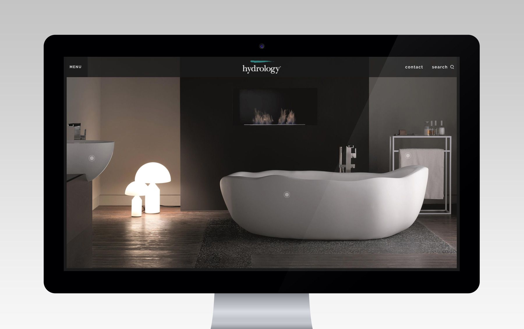
Hydrology was seeking to create a whole new website that would better align with their luxury brand, while also being extremely functional, user-centered and an inspirational experience for all of their visitors.
Defining our audience
One of the first steps we took when starting this project was creating personas to represent the different types of users who would be coming to this site. Hydrology has a wide audience of people that use their site, from private consumers, to architects, interior designers, commercial developers and contractors.
Each of these groups use the site in slightly different ways, and for slightly different reasons. Since we had to build a site that could accommodate all of these unique users, we used personas to cross check our decisions, and refined until we had the simplest and most intuitive solutions.
Featuring multiple products in one image
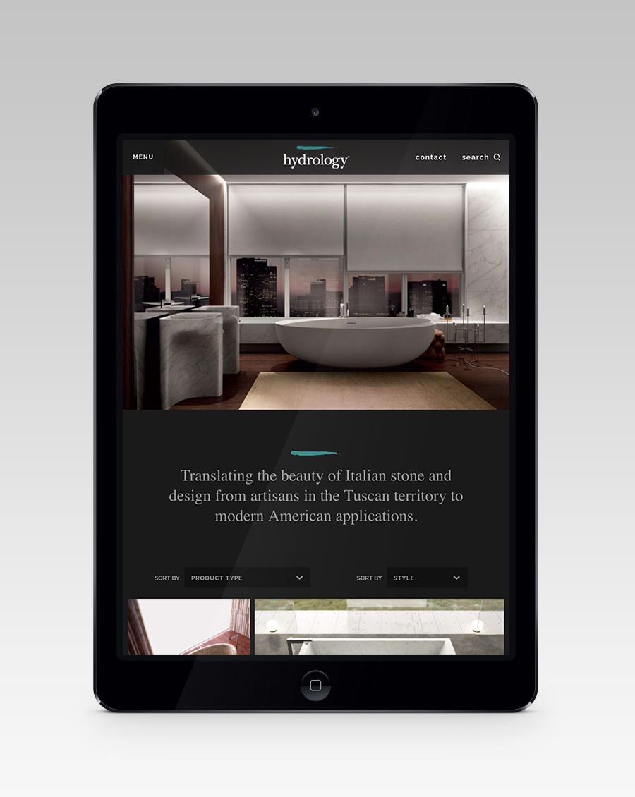
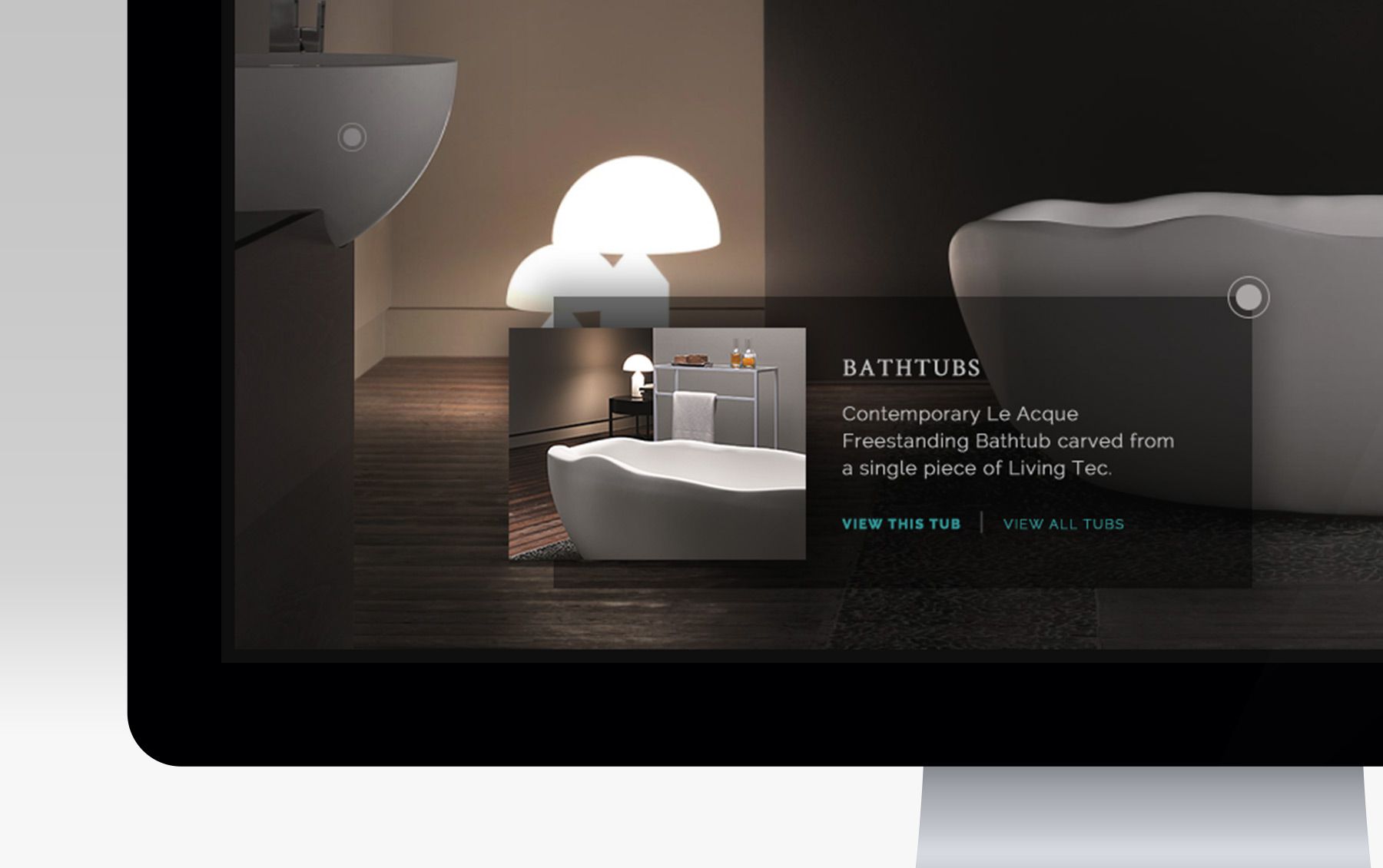
Hydrology wanted to feature multiple products above the ‘fold’ on their homepage. Rather than use a rotator, which has proven to not be very accessible, we opted to go with something that was a little more intuitive. When a user lands on the homepage and is shown a photo with multiple products, we wanted them to be able to click a product in the photo to find out more information about it. This was when we came up with the idea for the 'drop.' We created a small radial button that Hydrology could position using their CMS. When clicked, it would expand and show additional product details. The fact that Hydrology could position it themselves meant that they could update the masthead photo without having to come back to us to update the drops.
Defining our grid
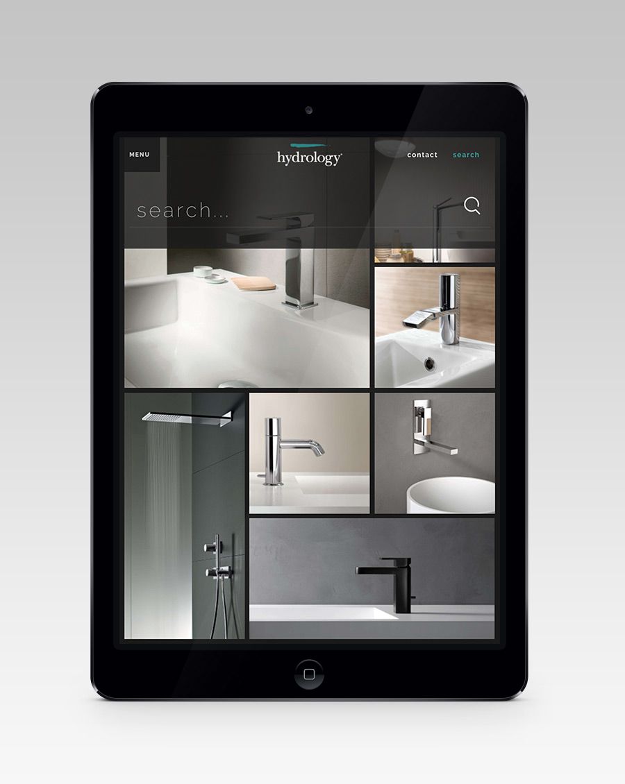
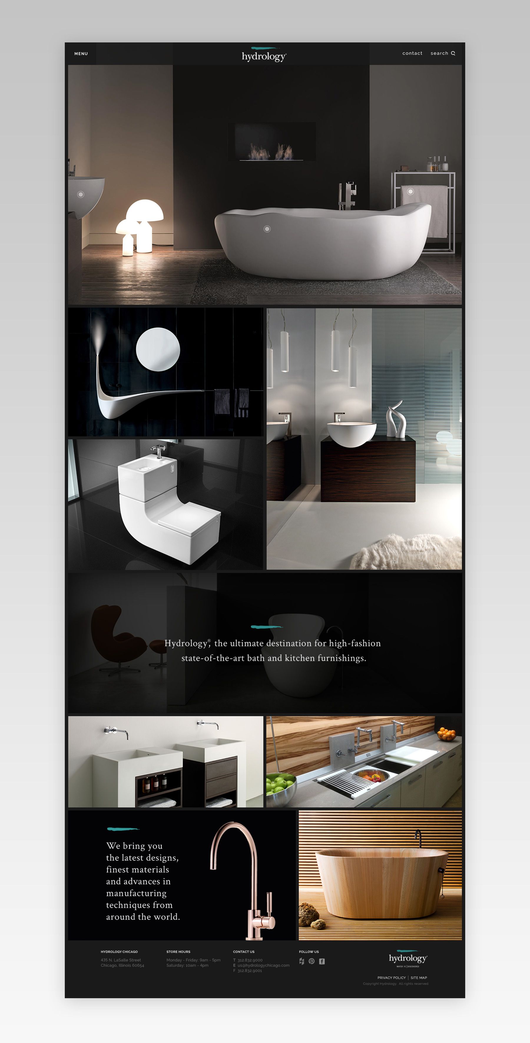
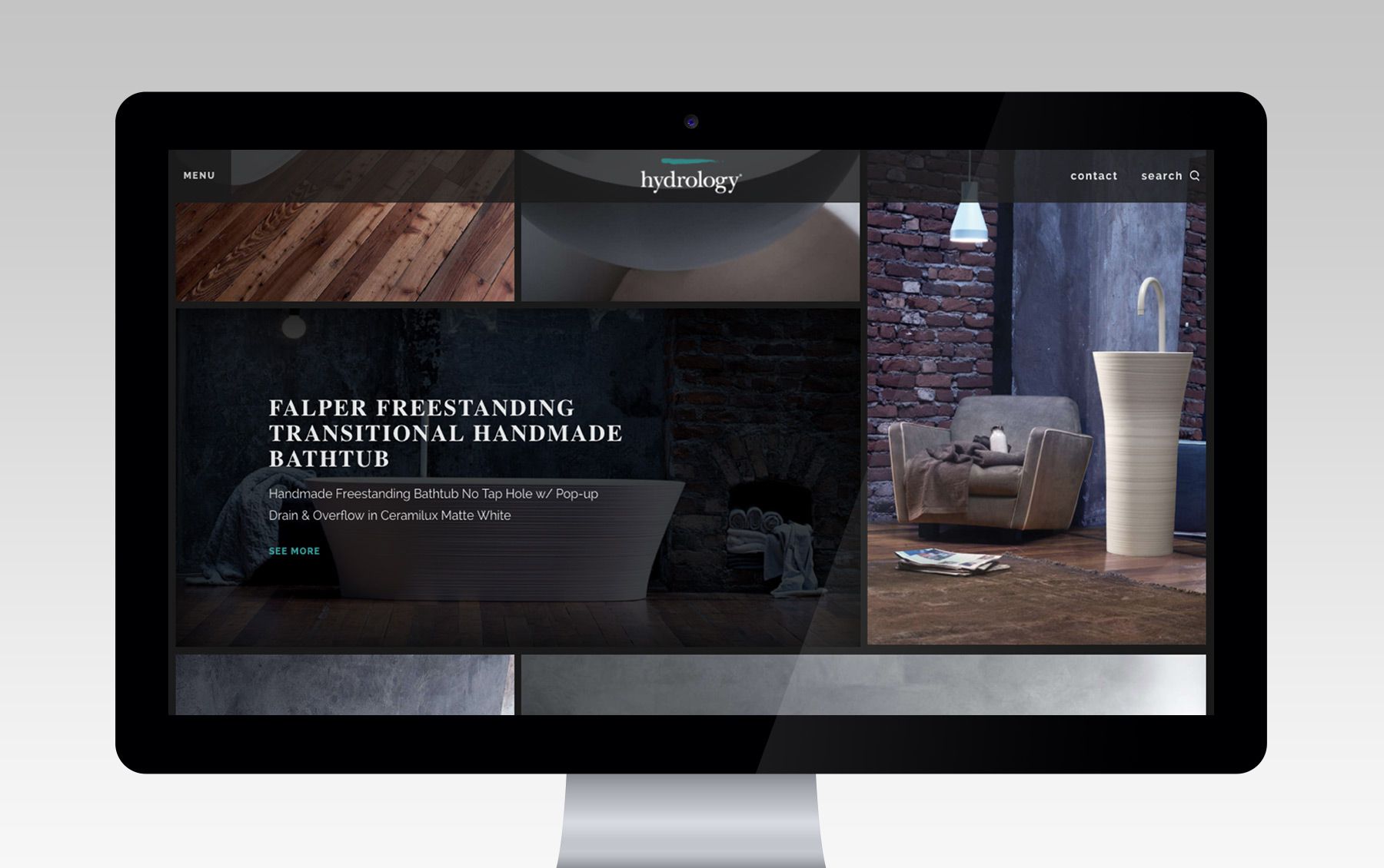
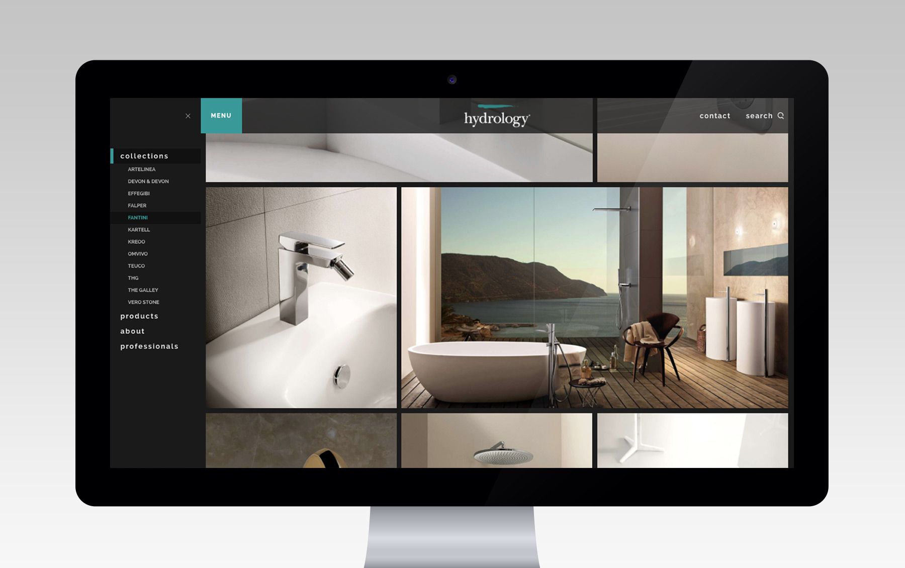
Using a lot of photography to show the products lined up with one of the client's goals for the site, which was to help them portray the ‘world of Hydrology’ to potential clients. The problem we ran into was how we we’re going to show all of their products (well over 1000) on multiple screen sizes when the photos themselves came in all shapes and sizes. If we picked one photo size for our grid and cropped everything to fit, we ran the risk of accidentally cutting off the main product. On the other end, it would require us to manually go in and crop all of the product images, which would have not only blown our budget, but also wouldn’t be very future proof for when the client wants to add more products.
The solution we came up with was to use a spreadsheet to identify every product image as either vertical, horizontal, or square. We were then able to feed that information into a grid we built using Masonry with vertical, horizontal and square blocks. When the user clicks ‘load-more’ the javascript automatically looks at the photos that have been pulled in already, figures out which new photos still needed to be displayed, and then dynamically pulls them in to fill in the open slots.
The product detail page
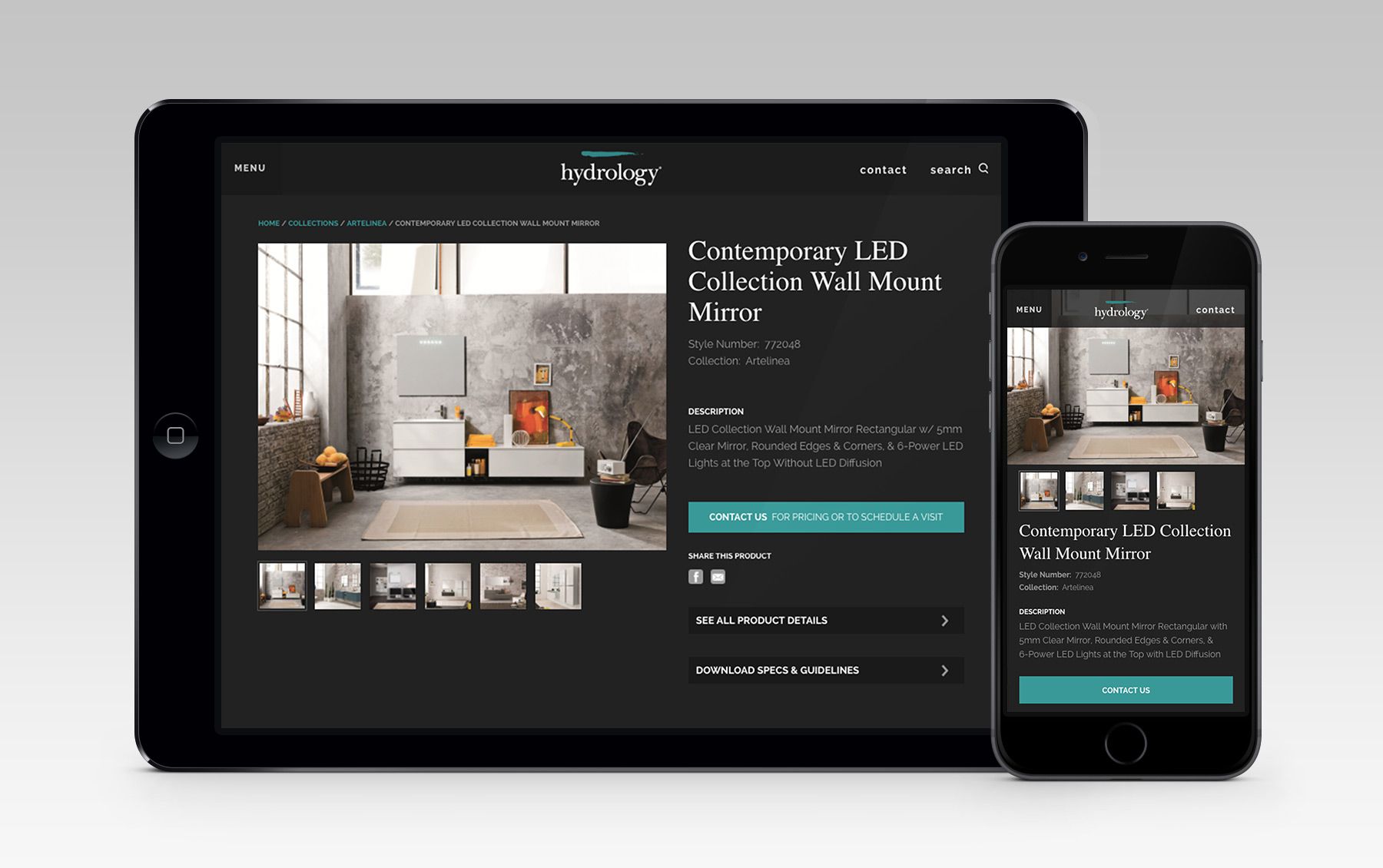
The product detail page was one of the pages that all of our user-personas needed for completely different reasons. The consumer needed it to see more photos and basic information about the product. The architect needed detailed information about a product's size, weight, and material. The developers and interior designers needed to quickly and accurately identify the product to get an order started.
We decided to treat this page similar to an e-commerce experience so it would feel familiar to most, especially our consumer, while using accordions to hold all of the extra necessary details. This allowed us to create a page that worked for all of our personas, without adding confusion from an overload of information.
