Overview
Visual design · Interaction design · Front-end support
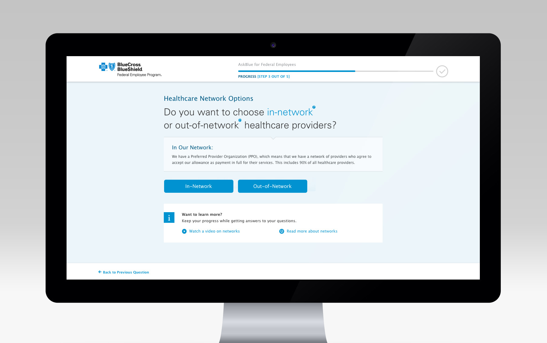
The Blue Cross and Blue Shield Federal Employee Program (FEP), covers roughly 5.3 million federal employees, retirees and their families out of the nearly 8 million people who receive their benefits through the Federal Employees Health Benefits Program. AskBlue is an interactive tool they provide to help their customers choose which plan is right for them.
Their previous site was built a few years ago using Flash, which meant that it didn’t work on mobile devices, had no real analytics, and was starting to look a bit dated. Our task was to do a complete overhaul of the AskBlue tool to bring it up-to-date with today’s standards, while also finding ways to improve the overall experience and increase completion rates.
Mobile first
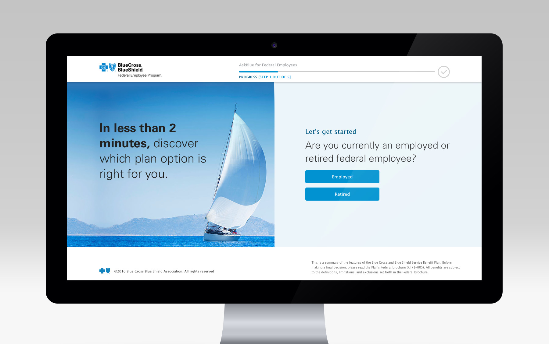
Looking at some of the data Blue Cross Blue Shield provided, as well as the client goals, we decided early on to start with a mobile first approach. A lot of users visit the site from their mobile devices, and are already familiar with those interactions, so we thought it would be best to start there and scale when necessary.
Built as a single-page app
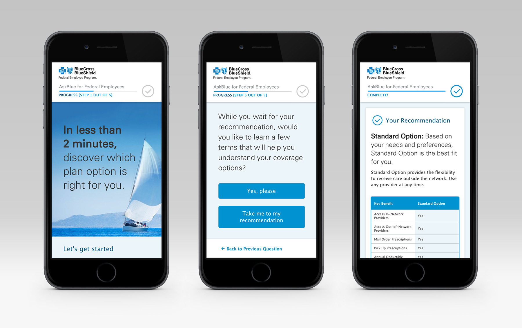
We wanted the experience to be as quick and smooth as possible. With the previous Flash version, there were frequent load screens between questions. For the new design, we decided to build it as a single page app, with an animated progress bar. The single page allowed us to get rid of the loading screens and replace them with smooth transitions, while the progress bar gives users a sense of how much they’ve already completed and how much they still have left.
More ways to inform the user
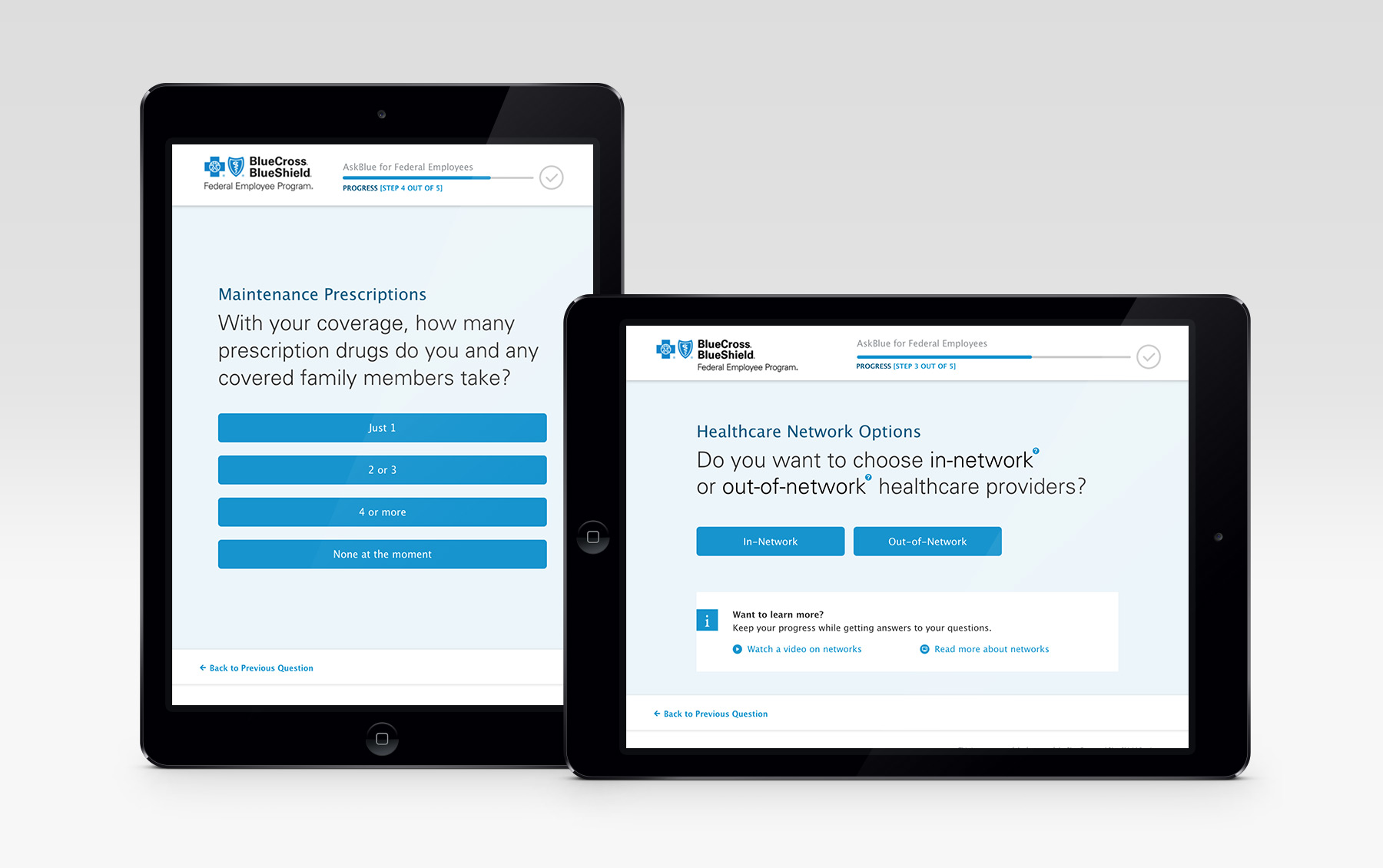
Since the primary purpose of AskBlue is to inform, we wanted to find as many ways that we could improve upon that with the redesign. One thing we noticed early on when testing the design was the use of terms that we didn’t understand ourselves. The solution we came up with was adding extra help links and information icons for the user to click to when the content introduced new concepts / language that could be confusing.
