Overview
Visual design · Interaction design · Front-end support
ACG is a community for investors, executives, lenders, and advisers that are focused on driving middle market growth. They’re a chapter-led organization that focuses heavily on events, holding over 1,200 around the world each year for industry professionals and the association’s 14,500 members to network.
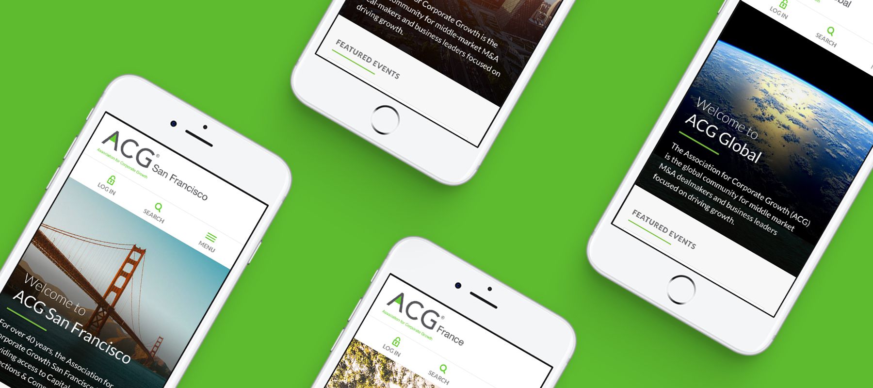
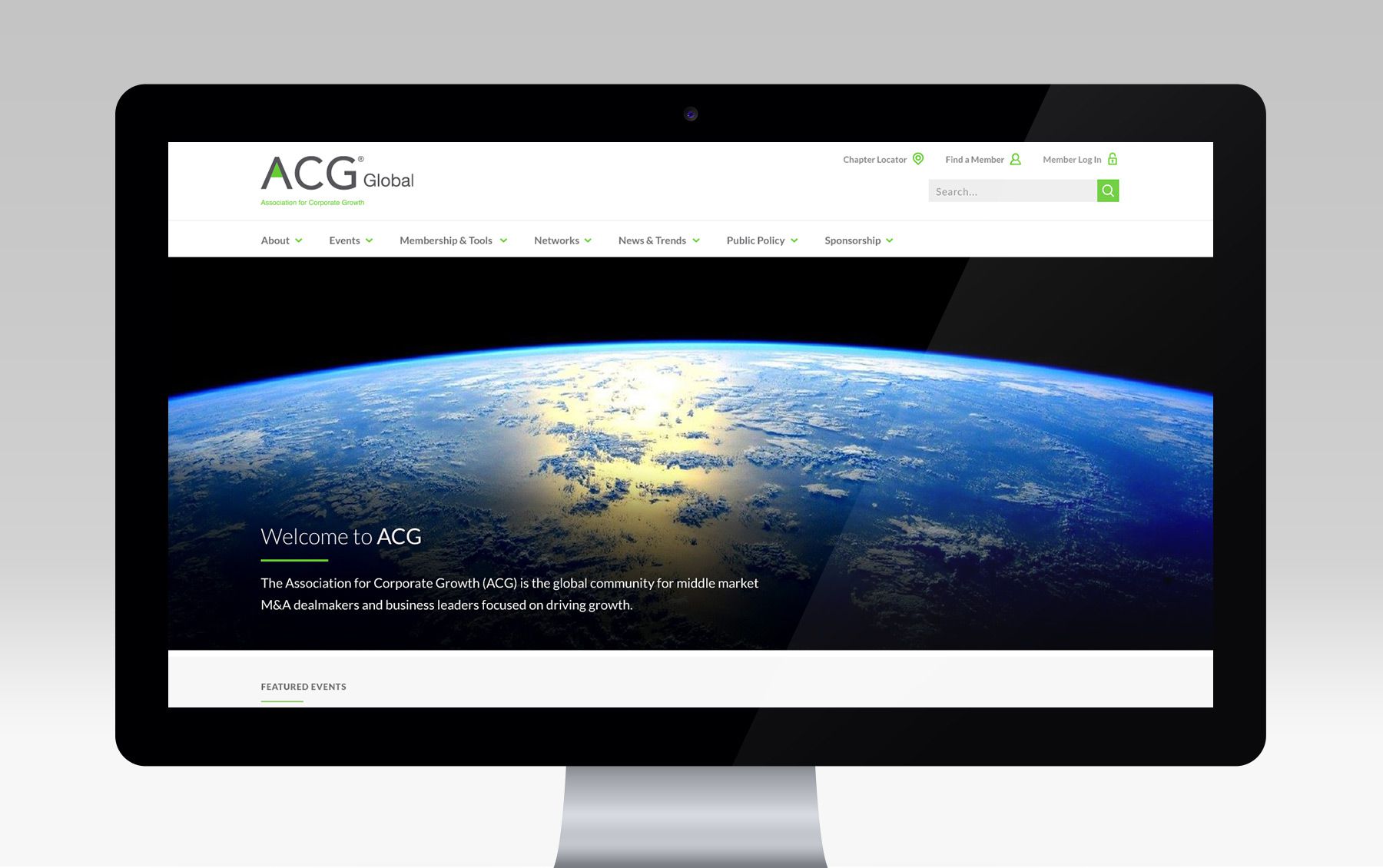
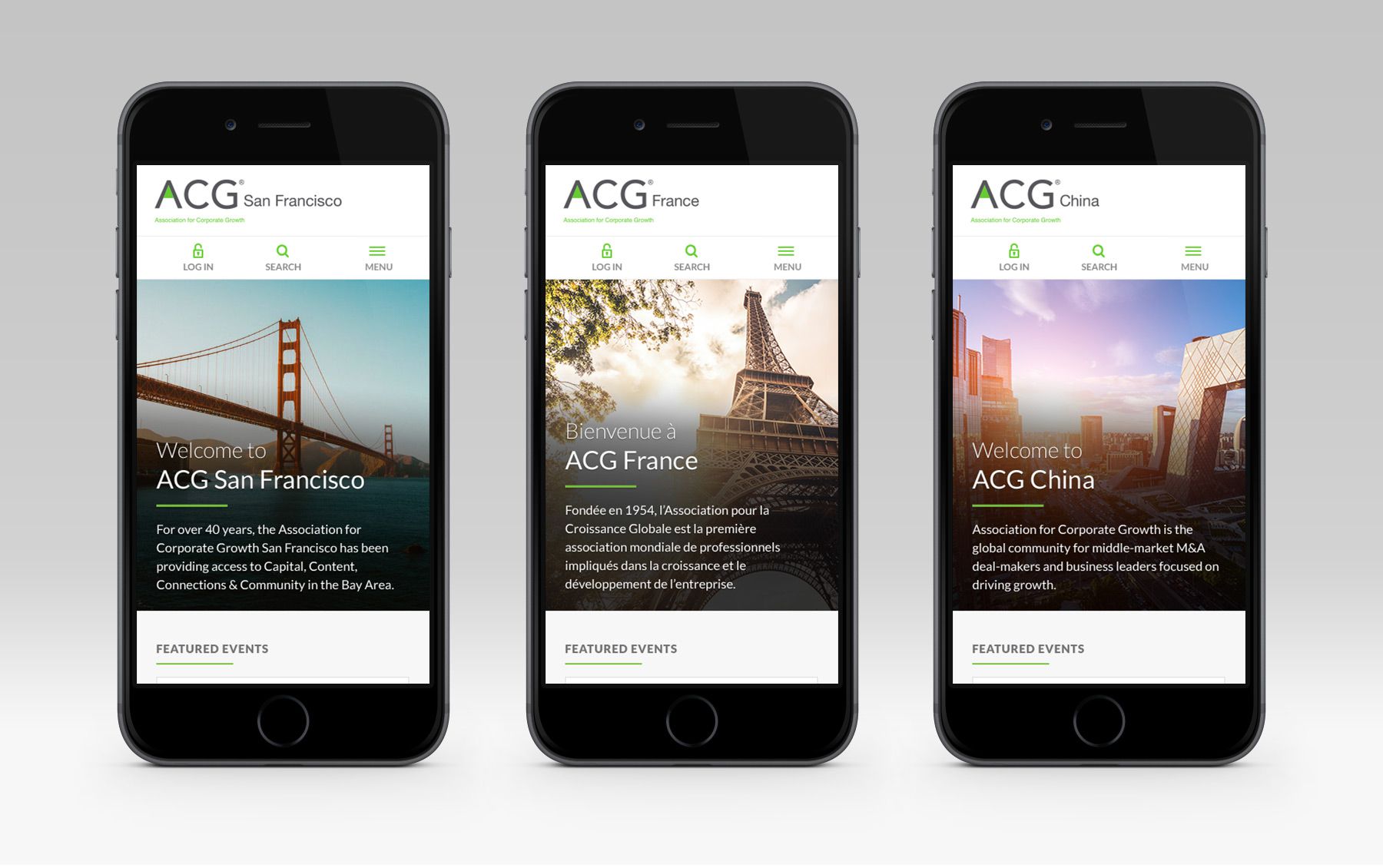
To align the global organization and each of the 58 chapters, we completely reimagined their site, and built it using a modular design system that could easily adapt to various chapter needs.
Creating a series of components
Creating a website that’s intuitive and user-friendly can already pose some challenges. So when we were tasked with creating one that could also easily be adapted to work for all of ACG’s chapters around the world, each with their own needs and goals, we knew we had to approach this project with an ‘atomic design’ mindset.
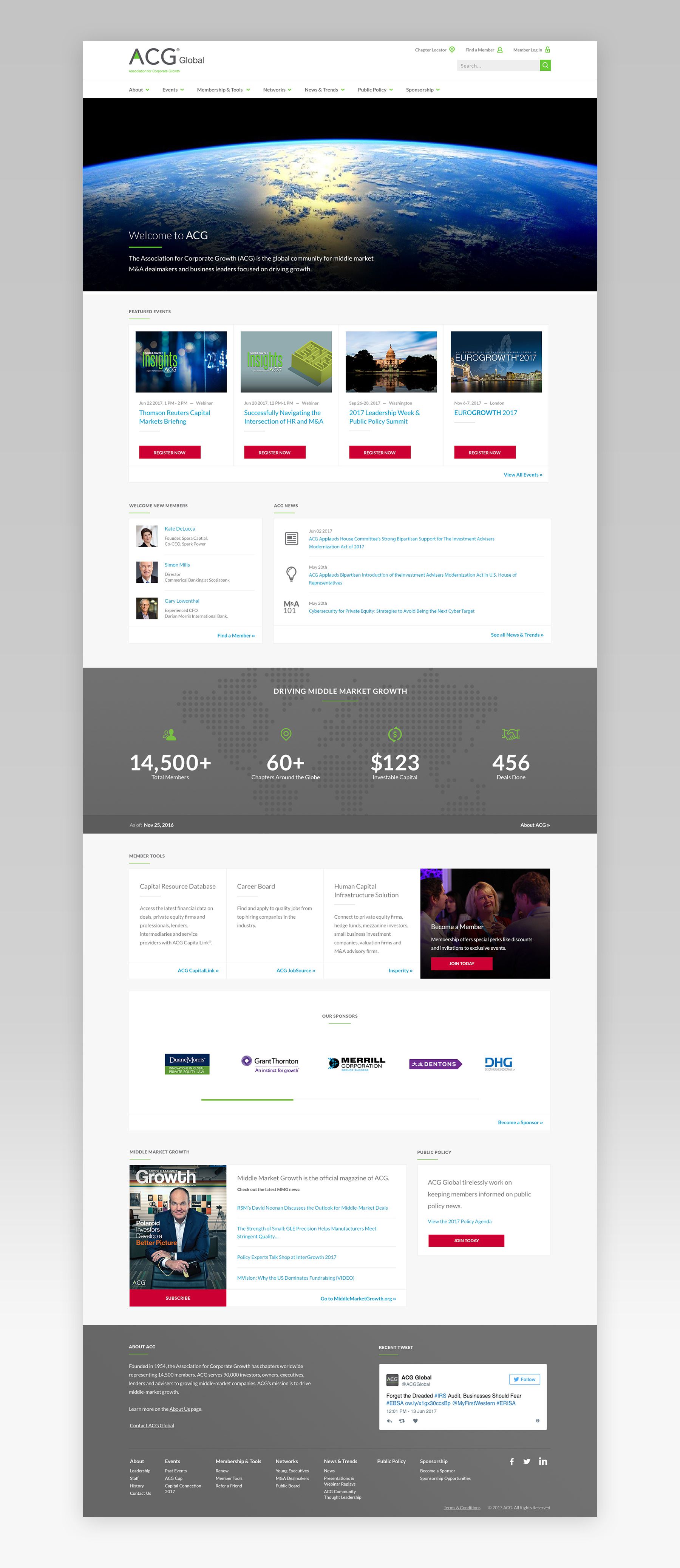
We started by doing an audit of all of the pages and content types that each of the chapters could potentially feature, to get a better idea of the types of components we would need to build. I learned early on that we would be needing something that could be used in a modular way, which helped me decide that the UI should use ‘cards’ for their ability to adapt to the content they contained while also grouping similar pieces of information. This allowed me to quickly iterate on potential components, consolidate when necessary, and build a design system that was flexible.
Events were the primary focus
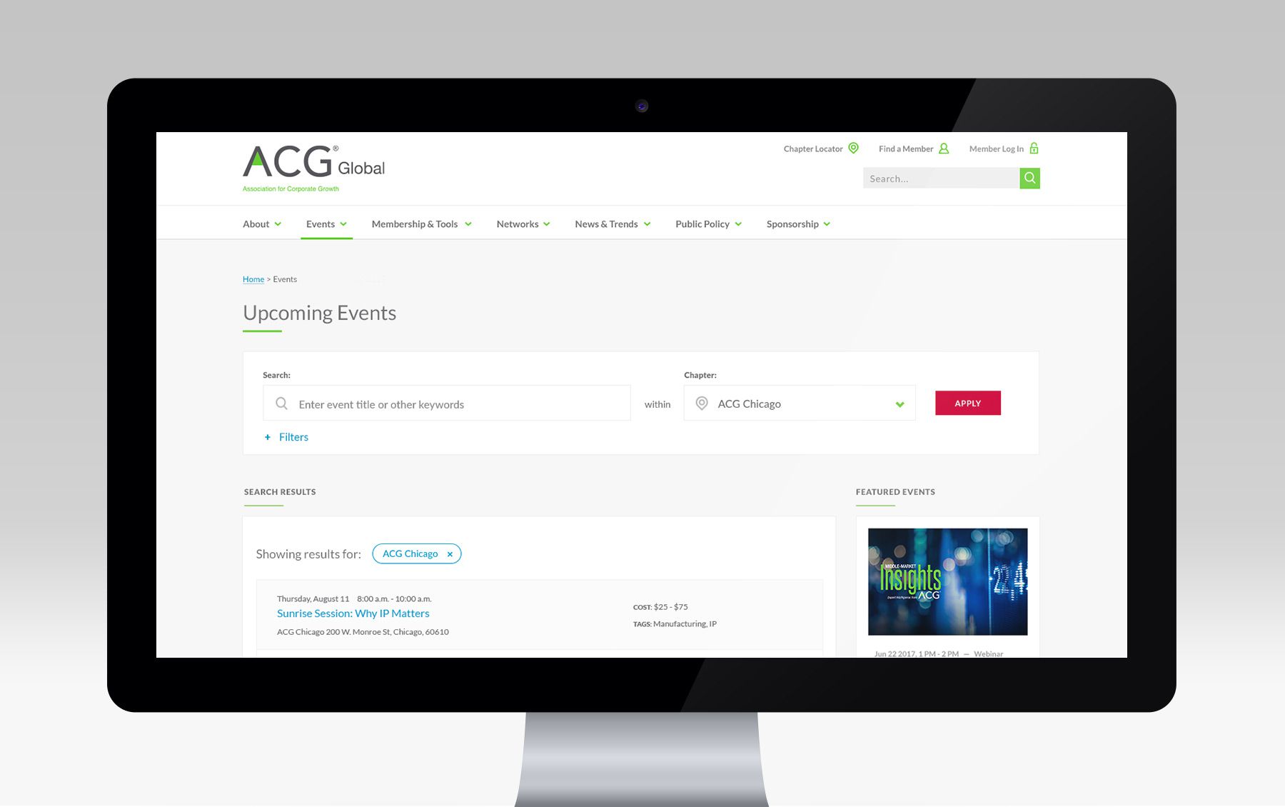
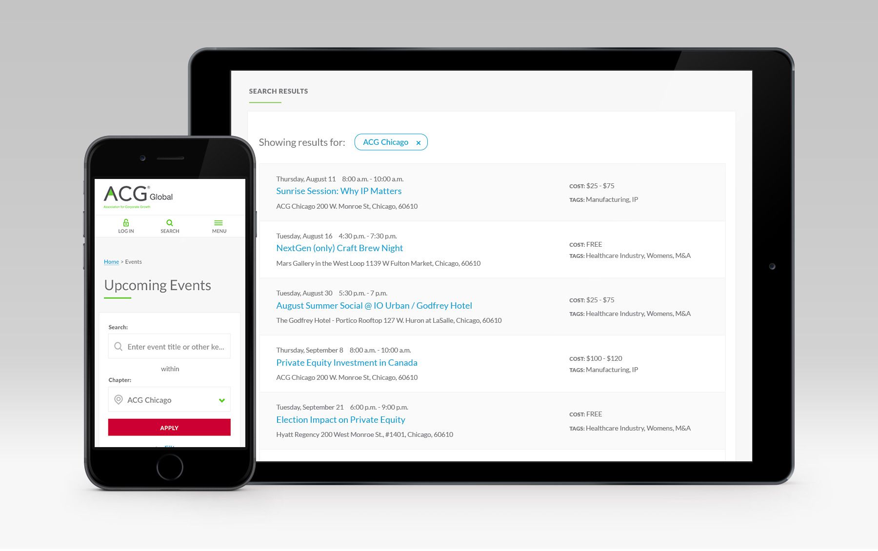
One of the primary goals for ACG’s users is to search for an event, learn more about it, and register to attend. We created a robust search tool that allowed users to narrow their results by chapter, region, and industry.
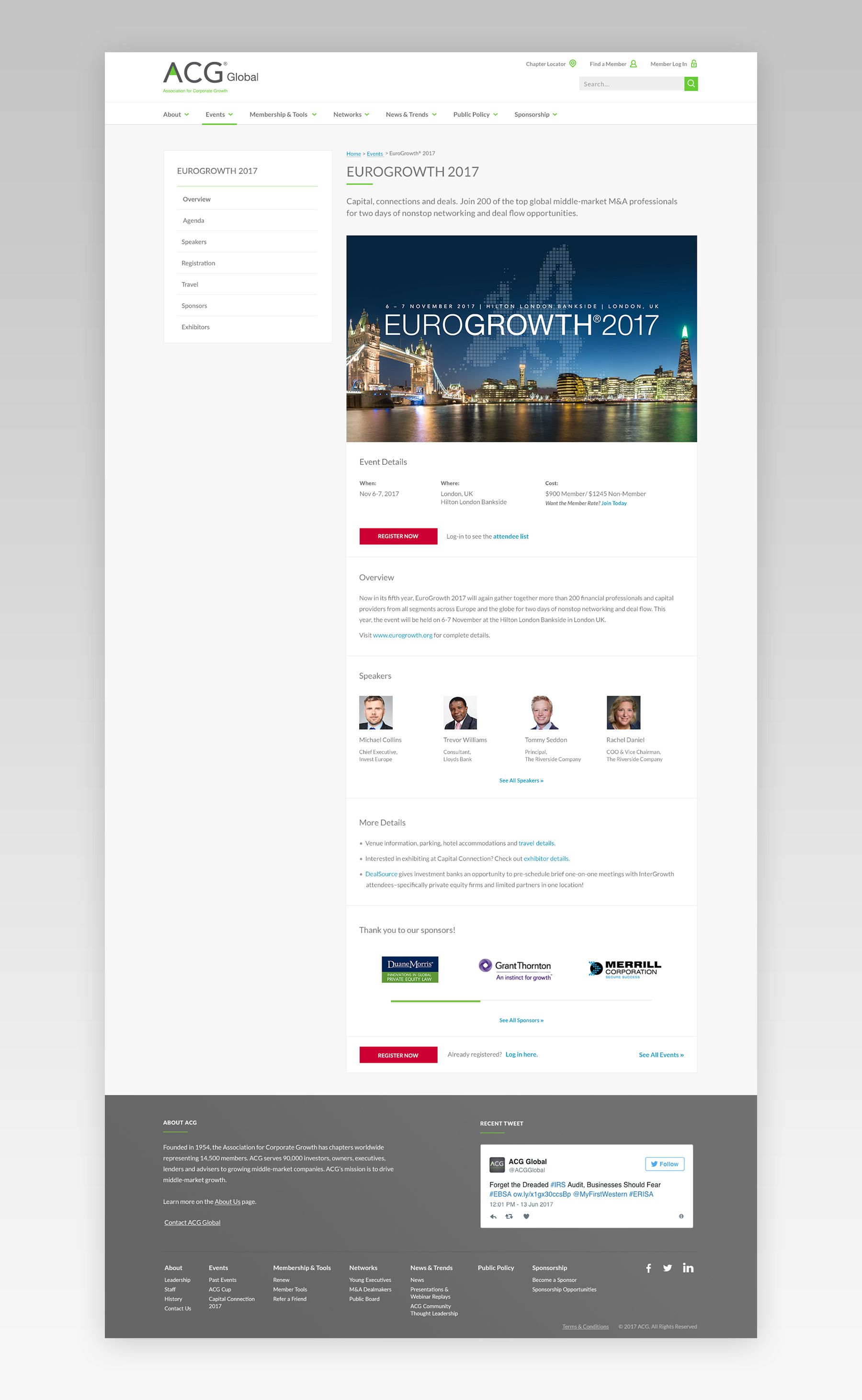
Event pages were separated into two types – complex events, which needed to show a lot of additional details like travel information, sponsors, exhibitors, an online agenda, etc; and simple events, which were generally much smaller, local events, that only needed basic overview info. I started with the simple event type, and used our modular components to design something that could easily be expanded on to create the complex event type. This meant that while both pages featured different content, they still felt similar and didn't require users to learn another page type.
The final piece was creating a quick and intuitive checkout process for the events that required users to purchase tickets.
