Overview
UX design · Interaction Design · Visual Design · Front-end support · Documentation
The American Planning Association (APA) is a professional organization representing the field of urban planning in the United States, and is dedicated to creating communities that offer better choices for where and how people work and live.
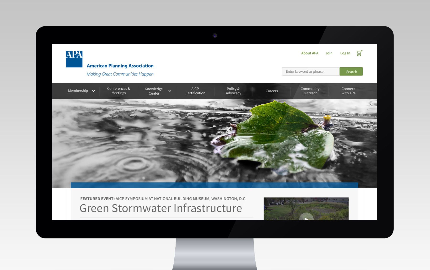
To better connect with their communities online, APA enlisted us for a complete site redesign, which included an e-commerce solution, event registration, and member personalization.
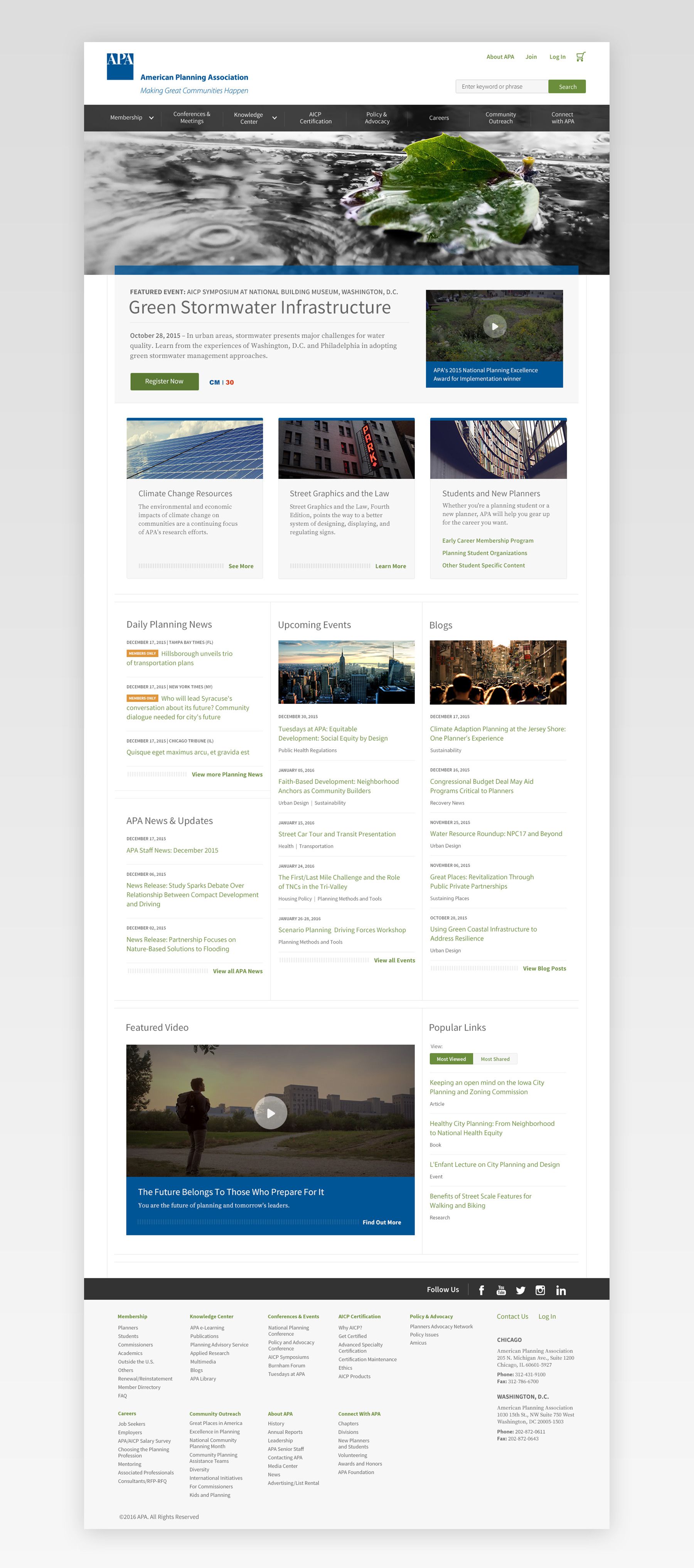
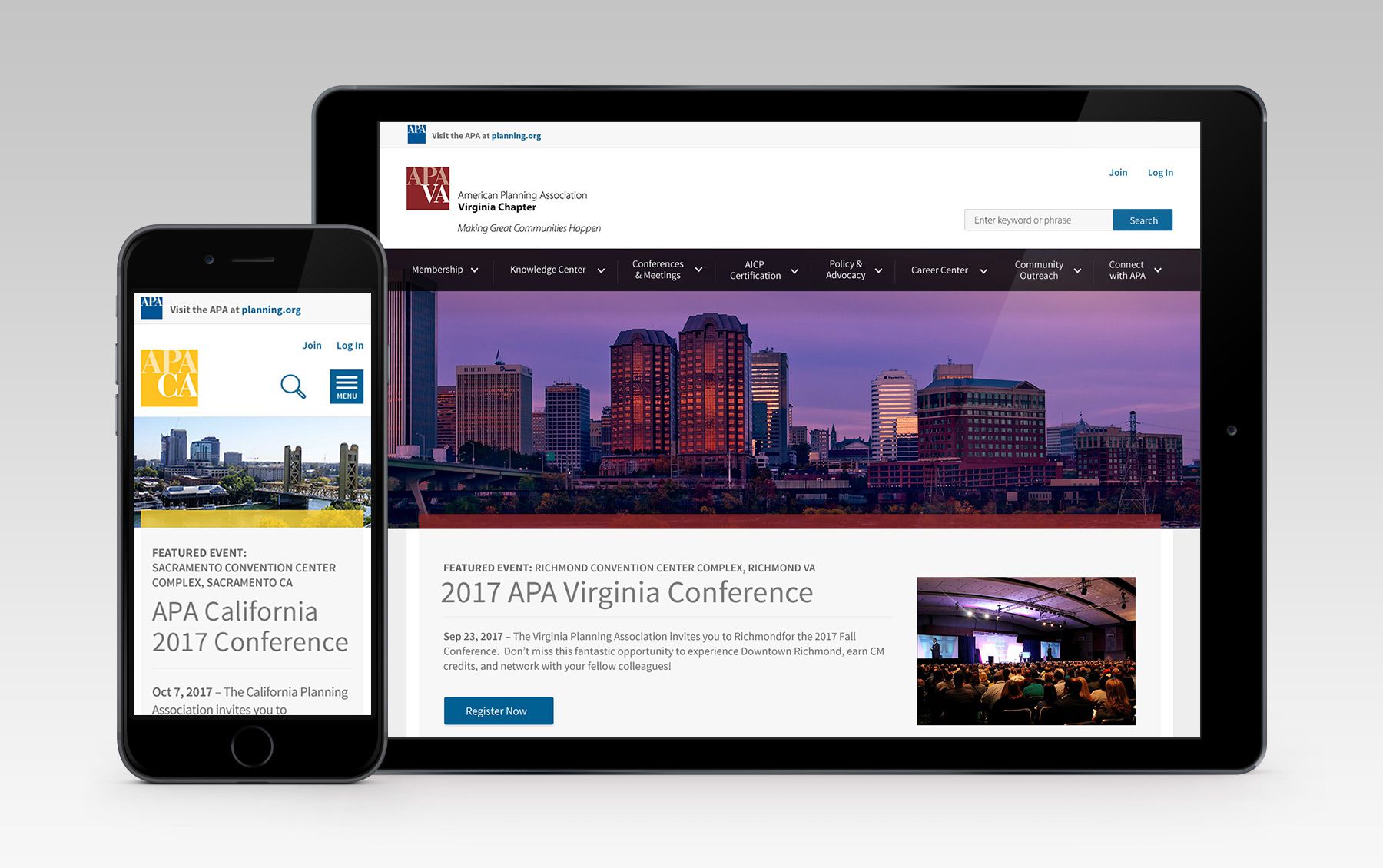
Atomically designed
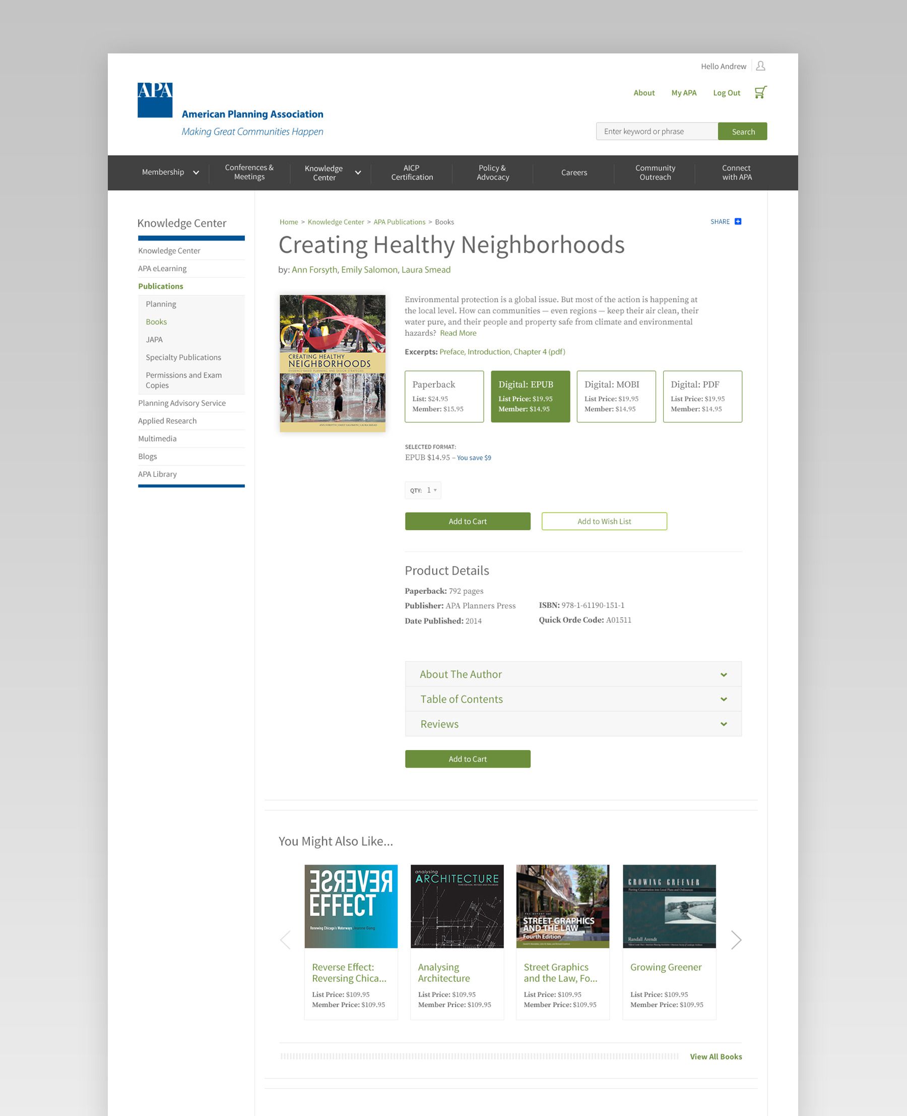
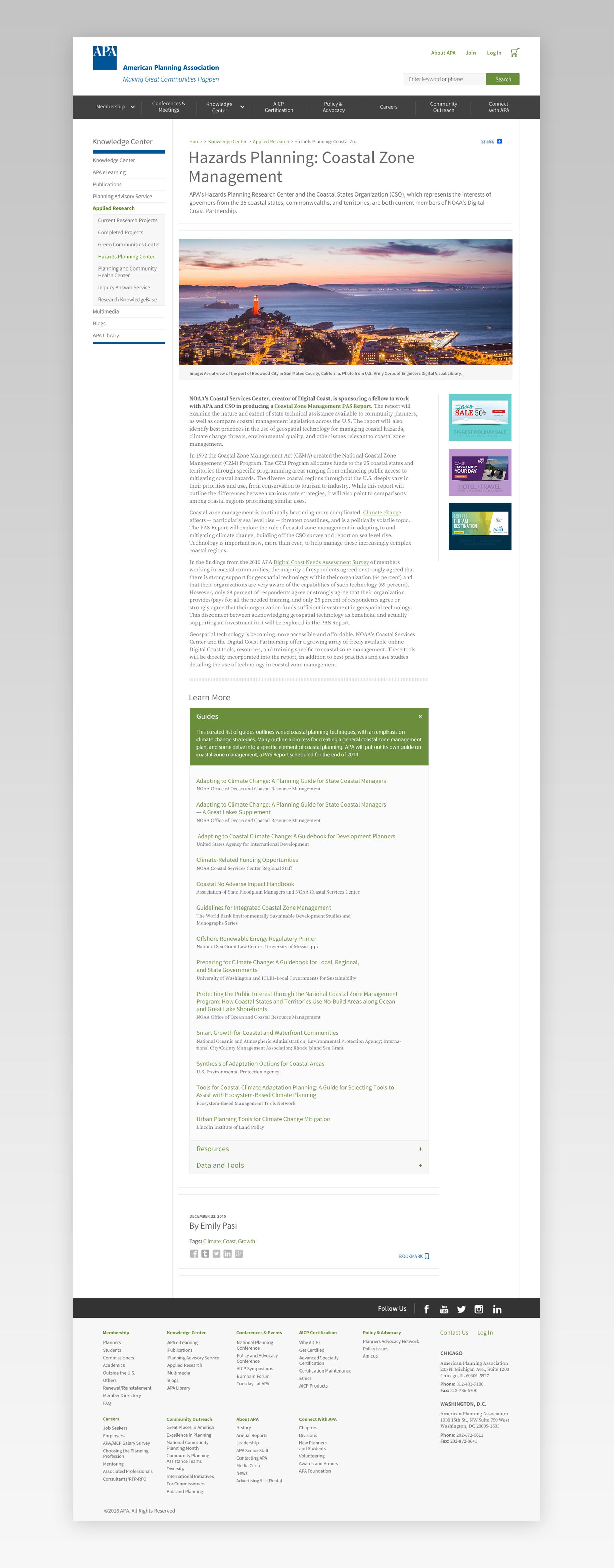
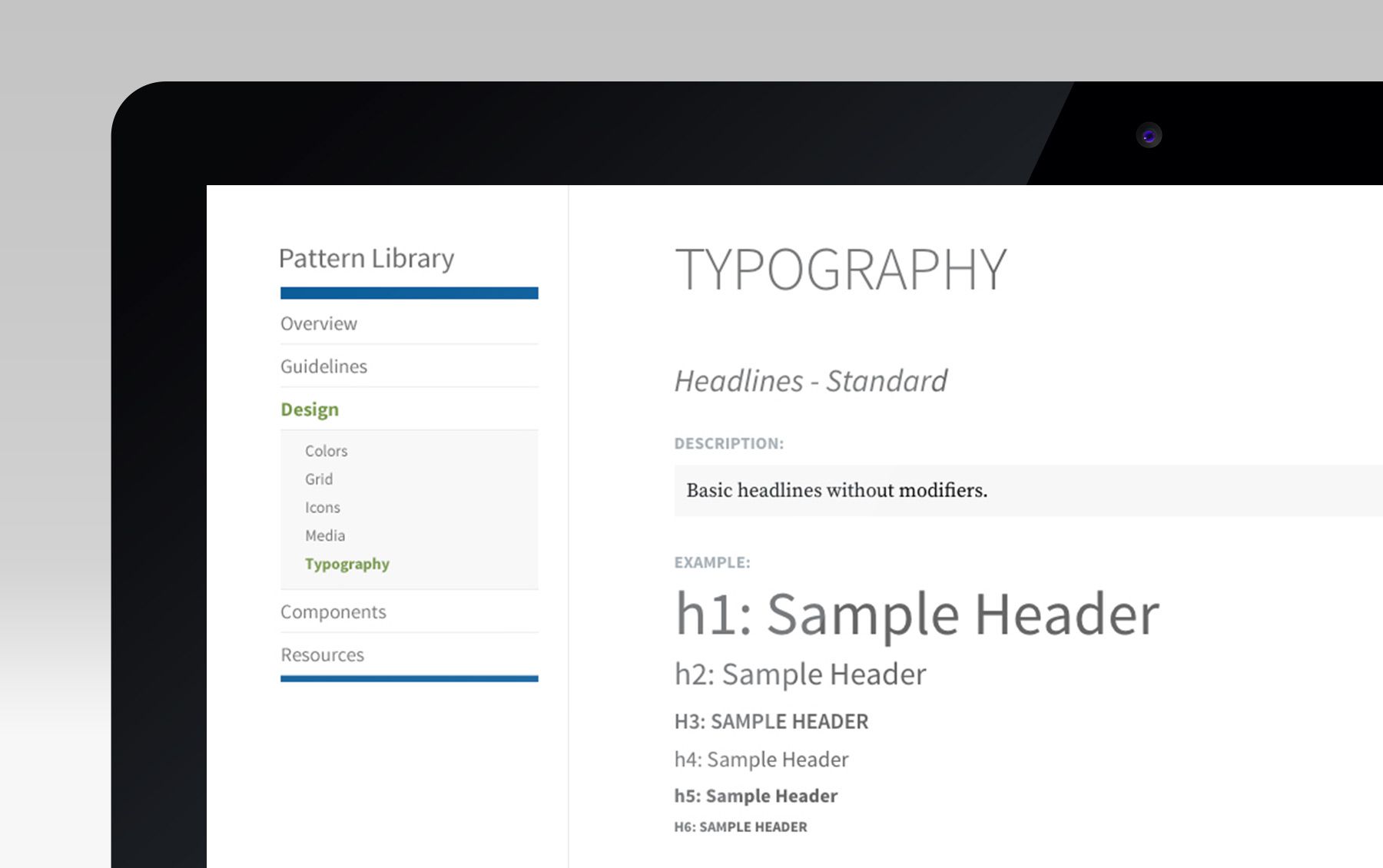
APA was a large site with dozens, if not hundreds, of pages of legacy content that had to be ported to the new site. They were also building out the site in their own CMS, which meant we would be doing a lot of the initial dev work, and then passing it off to their team to build out the rest of the pages / templates internally. To tackle this project, we decided to take the ‘atomic design’ approach, as well as create an online style guide that APA could share internally to their developers.
In the early stages of the project, I worked closely with our UX lead to identify and document the different components that would be needed to build out the site. This helped us decide which pages to design first, since we wanted to start with the ones that used the most components so that we could begin testing them early on. As I designed more pages, I worked closely with our developers, as well as APA’s internal dev team, to refine our components and establish ‘rules’ around their use.

Navigation
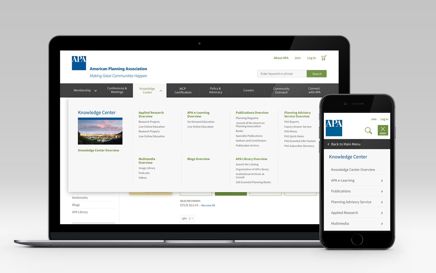
APA's site structure was multiple levels deep, which meant some important content would be tucked away and hard to find if we didn't come up with the right solution. I worked with our UX lead to build something that helped users orient themselves and find the information they needed quickly. We tested a few iterations of the mobile nav and kept refining until we had the simplest and most intuitive solution.
